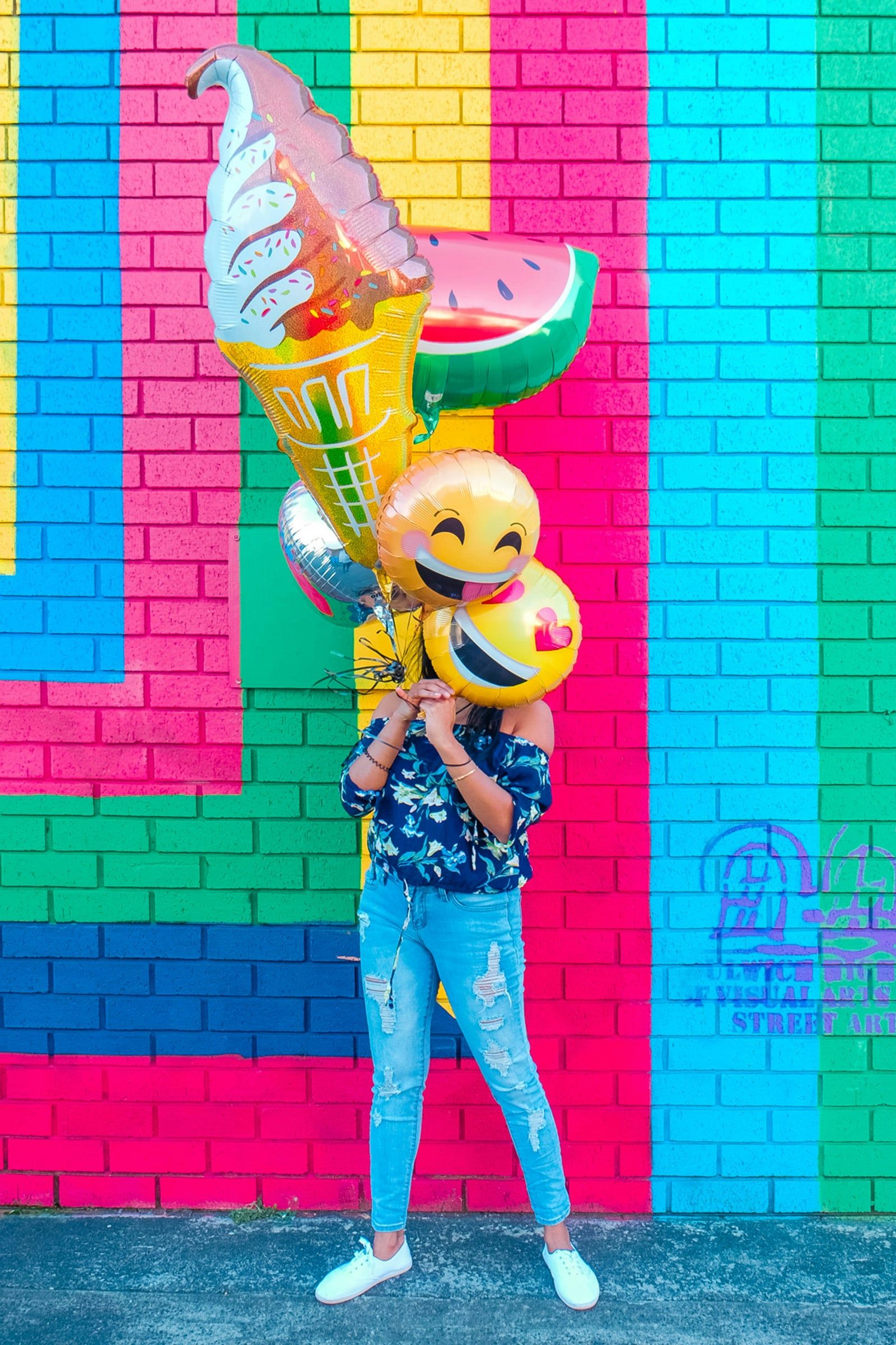
Colour is one of the most powerful tools in a designer’s kit. It’s often the first thing people notice and remember about a brand, and it influences how they feel about it, sometimes without them realising. But colour psychology is more nuanced than “blue means trust”. Here’s how to think about it.
Common colour associations
While responses vary from person to person, some broad associations are widely shared in UK and Western markets:
| Colour | Common associations | Often seen in |
|---|---|---|
| Blue | Trust, calm, professionalism | Finance, tech, healthcare |
| Red | Energy, urgency, passion | Food, retail, entertainment |
| Green | Nature, growth, health | Environmental, wellbeing, gardening |
| Yellow | Optimism, warmth, attention | Leisure, children’s brands, signage |
| Orange | Friendliness, enthusiasm, value | Retail, creative, budget brands |
| Purple | Luxury, creativity, wisdom | Beauty, education, premium products |
| Black | Sophistication, authority, elegance | Fashion, luxury, design |
| Pink | Playfulness, care, modernity | Beauty, lifestyle, challenger brands |
These are starting points, not rules.
Context is everything
The same colour can mean very different things depending on how it’s used. A deep, muted green feels heritage and premium; a bright lime green feels fresh and youthful. Shade, saturation, and the colours around it change the message entirely. Culture matters too: white suggests purity in many Western contexts but is associated with mourning in parts of Asia, which is worth considering if you trade internationally.
Fit matters more than meaning
Research into colour and branding suggests that what matters most is whether a colour feels appropriate for the brand. A palette that matches your personality and your customers’ expectations builds trust. One that clashes with them feels off, even if people can’t say why.
Standing out from the crowd
If every competitor in your sector uses navy blue, another navy logo will blend in. Sometimes the boldest move is a colour that breaks category conventions while still feeling right for your values. We always review the competitive landscape before recommending a palette.
Building a practical palette
A strong brand palette usually includes:
- One or two primary colours that people will associate with you.
- A few supporting colours for variety across materials.
- Neutrals for backgrounds and text.
- Accessible combinations with enough contrast that text is readable for everyone, including people with visual impairments.
Every colour also needs defining for each medium: Pantone and CMYK for print, RGB and HEX for screens. Colours can shift noticeably between a monitor and paper, so these values keep things consistent.
Let’s find your colours
Whether you’re building a brand from scratch or wondering why your current palette isn’t working, we can help you choose colours that reflect who you are, appeal to the people you want to reach, and work beautifully in print and online.
Thinking about your brand colours? Get in touch for a friendly chat with our design team.